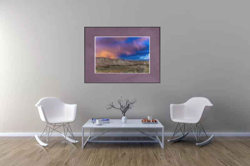
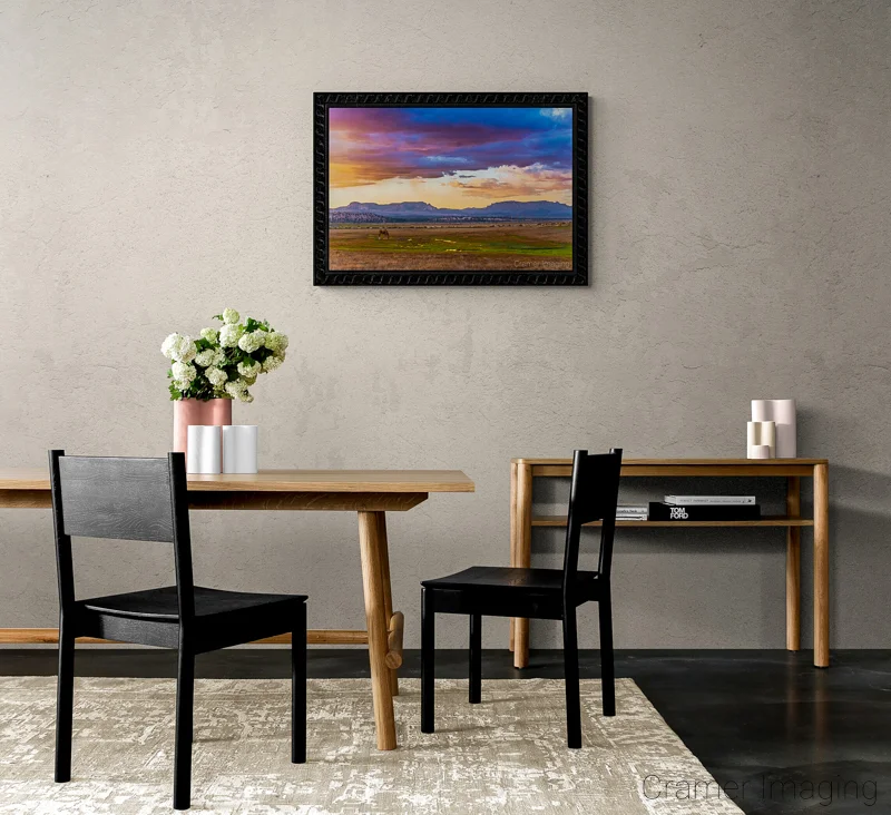
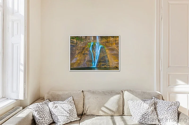
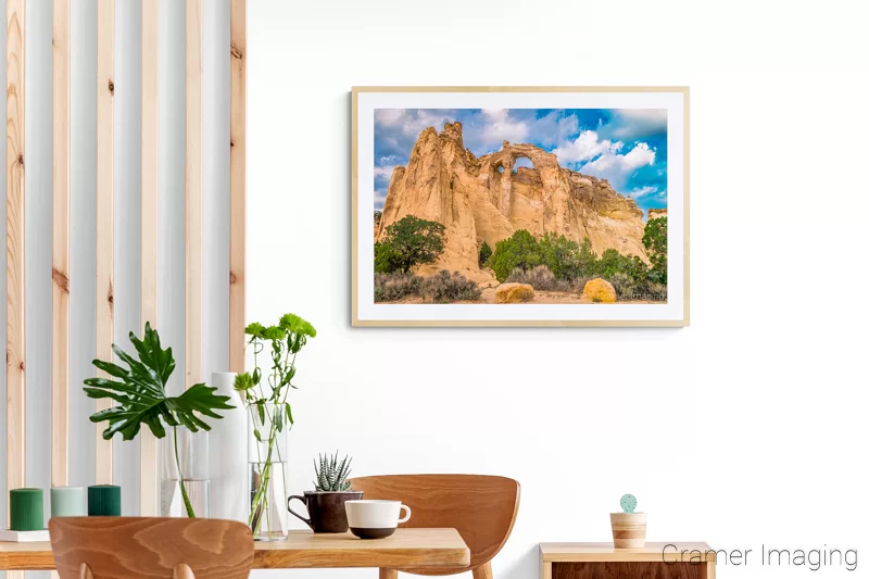
With fine art being as expensive as it is, it might as well really shine and dominate the stage of your room. It is, after all, meant to draw and keep your eyes in addition to covering a blank and boring wall with something worth looking at. So, how do you do this? How do you place a spotlight or focal point onto the fine art on your wall without being literal? We’ve got answers for you.
Go Big
When it comes to fine art dominating the area, there’s only one way to go. It’s ‘go big or go home.’ This means that you need to use big prints. The bigger the wall you want to display your fine art on, the bigger the print you will need to buy. No little 8×10 sized print is going to work. You need something huge. 16×20 or 16×24 inch prints are the starting point for big fine art prints. Choose something which is big enough to fill much of your wall by itself.

Negative Space
While going big is the absolute way to go for making fine art the focal point of a room, there’s more to consider. Think about what the art will look like if there’s no room for it to breathe. It will look squished and smothered by the space it’s in.
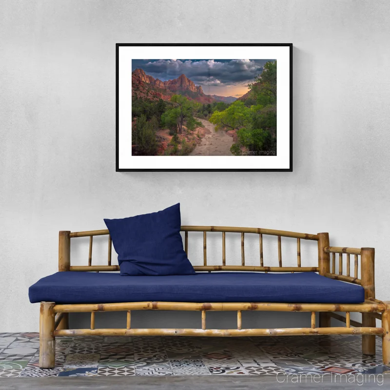
While going huge with buying fine art prints, make sure that you have some negative space around the print. Negative space is empty space which surrounds something important. It’s with this empty space that we feel your artwork isn’t crowded and has room to breathe.
Minimize Accessories and Other Decor
There’s one other consideration for making a piece of fine art have full impact on your wall. You need to not distract from it with other elements. This can be more pictures or wall hangings on the wall or it can be other elements of the room such as flower vases, furniture, or even light fixtures.
If you really want a piece of fine art you bought to dominate the scene and be the focal point of your room, you cannot place anything in the room which would compete with the art. Anything which complements (completes) or adds to the art is fair game. Anything which would block the view or detract from the art must be removed.
Conclusion
In conclusion, it is a careful balancing point between completing a look and overdoing it. The same is true for the focal point of room. Make sure that you are following these tips of going big, creating negative space, and minimizing distractions in order for your fine art to have maximum impact.
Do you have any examples of rooms where a single piece of fine art is a perfectly devised focal point? We would love to see them. Please share them in the comments section so we can all be inspired for our own homes.

