Now that you have your gallery wall and several pieces of art to display on it, you face the question that all designers face. You face the challenge of making sure that your wall doesn’t become too cluttered in the process of decorating it. So, how cluttered should your wall be? The answer to the question of how cluttered your wall should be is “How cluttered do you want it to be?”
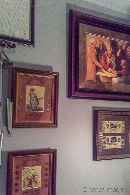
Clutter, in all its definitions, generally means that there is excess matter which has no place or organization. It is an eye sore or even a hazard. Lots of stuff, if properly positioned and ordered, is not clutter. It can even be welcoming if done right. If you don’t have some kind of order with your wall art, it will look cluttered.
When it comes to order and organization with your wall art, there are a lot of opinions here. I won’t go so far as to say that there are no wrong choices. However, your definition of order and clutter really depends upon what you want and what your personal taste is. For example, the definition of cluttered wall will change depending upon how many pieces of art you want to display on the wall at a time.
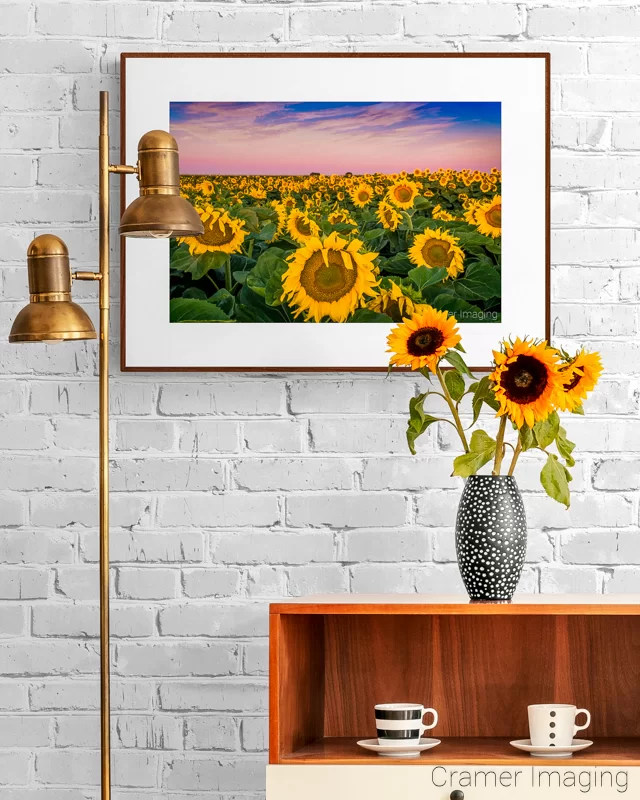
Perhaps you want to have one large and beautiful showcase art piece to focus on. That’s a great arrangement. It’s nice, simple, and organized. It will be an immediate attention grabber and will set off your wall beautifully. Because of this, your definition of ‘cluttered wall’ will be having more than one piece of art on the wall.
On the other hand, you may want to add some complementary pieces around that first piece. Your definitions will necessarily change just based on the fact that you will be using more than a single piece of art. If you are putting multiple pieces together, they shouldn’t be too close together to crowd one another nor should they be too far away from each other either.
Be aware that when you have a cluster of images grouped together, negative space is important too. It’s just as important as the space used by the frames and their content. When I say ‘negative space,’ I mean the unused space around the frame where the wall behind is visible to the viewer.
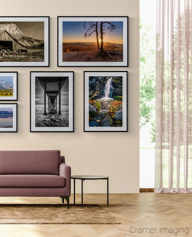
Without negative space, you eye doesn’t get a break and has difficulty telling where one image stops and another starts without effort. The images blend together and become indistinguishable. When that happens, the wall looks cluttered.
The opposite problem comes when there is too much negative space in between pictures. With too much negative space, your eye will begin to see each picture as independent of each other and disconnect them from any intended pattern, theme, or stylistic element. While this is not a problem often encountered, it does bring to light that there is a balance to strike when determining whether or not your wall looks cluttered.
When deciding if your wall is too cluttered or not, consider this good general rule of thumb. The larger the art you wish to display, the more negative space you need to not crowd it. This is for arrangements of art such as a gallery wall display. This trick will help prevent that overcrowded and cluttered feel easily.
When the wall art you selected gets big enough, you must also consider other elements of your home decor besides your other wall decorations. Will the couch crowd the art from below or will the art still have room to breathe? How about windows and doors? Is the wall art too close to other pieces of furniture? Will there be a door opening right into the art piece which could destroy it? Is there a floor lamp present which might impede viewing? I think you get the idea. You must address all of these concerns and more in order to prevent a cluttered wall feel.
I could go on about many more things which would make your wall look cluttered. The fact still remains that it is your opinion which matters most. If you are happy with your art arrangement, that’s great. If you feel there’s enough space for each element on the wall to breathe but still remain part of a larger whole, then you’ve accomplished your intent. Your wall is not cluttered. Enjoy the fresh and airy feel of style and color on your walls.

